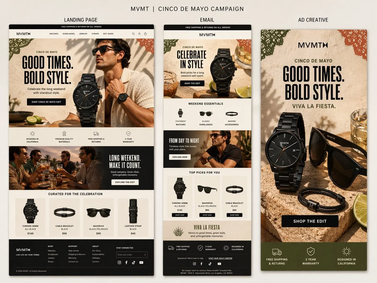
Create a presentation-style campaign board for MVMT's Cinco de Mayo campaign on a soft warm neutral background.
At the top, add the title
"MVMT | CINCO DE MAYO CAMPAIGN"
Below it, show three clearly labeled vertical panels side by side with subtle shadows
"LANDING PAGE"
"EMAIL"
"AD CREATIVE"
Overall style
Clean, , masculine-leaning, modern DTC design. The image should feel like a polished creative review board, not a collage. All three panels should clearly belong to the same campaign, with shared typography, colors, product styling, and seasonal details.
Use a warm, elevated palette
cream, sand, stone, black, charcoal, dark olive, terracotta, muted green, and warm golden accents.
Cinco de Mayo direction
Tasteful and refined, not cheesy. Use subtle festive touches like papel picado-inspired accents, citrus, warm stone textures, celebratory drinks, and sunlit lifestyle styling.
Shared headline direction
"GOOD TIMES. BOLD STYLE."
Optional secondary line
"VIVA LA FIESTA."
Panel 1 - Landing Page
Create the widest and most detailed panel as a tall desktop ecommerce landing page.
Include
- MVMT site header
- hero with bold headline
- black watch as hero product
- stylish male lifestyle model
- CTA button
- icon/value prop row
- supporting lifestyle banner
- curated product grid
- realistic footer
Panel 2 - Email
Create a slimmer tall ecommerce email mockup.
Include
- promo bar
- MVMT logo and header
- hero section with same campaign art direction
- curated
be clearly visible
- text should be mostly legible
- everything should feel , realistic, and cohesive
Avoid
cheesy fiesta graphics, bright rainbow colors, clutter, generic templates, messy collage styling, or cartoonish holiday visuals.
Output
A highly realistic single-image campaign board showing a landing page, email, and ad creative for MVMT's Cinco de Mayo campaign, all clearly labeled and designed as one cohesive system.